
So the other day I was looking for pest control companies online just to obtain a clear picture of the kind of flyers and Display Ads such companies use to promote their services. Needless to say, Google did its thing and came up with scores of suggestions within just a few seconds. While I thought many of the flyers I saw were interesting, I decided to pick out one to review here that looked rather generic. See for yourself:
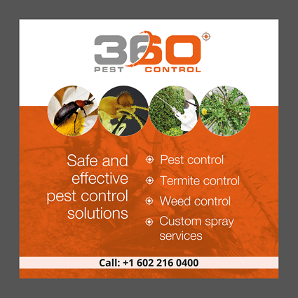
In many ways, this is a typical pest control flyer that you’d see online, slipped under your door, or on your vehicle’s windshield. Think about it, if I showed you a pest control flyer like this one, would you be impressed with what you saw? Is there anything here that would create a lasting impression on you? Now, I’m not asking these questions because this is a poorly designed flyer. After all it’s not. There are many things that this pest control flyer gets right even when it gets a few things wrong. Therefore, let’s go ahead and discuss some of the best and worst features of this ad.
The first thing that struck me about this flyer when I laid eyes on it was the color palette that’s used here. Is it just me or does your brain automatically mumble, ‘boring’ when you see the color grey in an ad? There’s just something about a basic grey border that is unappealing and generic. This is true even if the rest of the flyer has some great content in it. Also, it doesn’t help that the ad makers paired grey with burnt orange here as it doesn’t create an altogether pleasing effect on the eye. Even though this ad essentially features simple elements that should work well together, the color combination used here is off-putting, to say the least.
Take a look at the images featured in the ad and you’ll know what I’m talking about. The images consist of common household pests and how the pest control company in question proposes to deal with them. When viewed from left to right, these images attempt to tell a story from start to finish about how this company can provide solutions to pest infestations. Sure, it might look like I’m reading too much into what initially appears to be a set of random images thrown together. However, if you look at the flyer for a second or two you’ll see it too, particularly if you turn your attention to the written content that’s arranged into bullet points here.
Speaking of written content, this is among the better features of this ad. There’s nothing fancy here, just a few points outlining the kind of services that this company is offering you. Aside from the bullet points, the only other written content that’s featured in the body of the flyer here is the line ‘Safe and effective pest control solutions’. This one line conveys more than enough meaning for a flyer if you think about it. Safe and effective pest control solutions – what more do people look for in a pest control company?
Sure, the ad makers could’ve chosen to add more content here outlining the more salient features of this pest control company. Nothing that’s mentioned here can be considered as a USP of the company that the ad is promoting. Was this a lost opportunity? Perhaps. What’s more likely, though, is that the company or the PPC experts that designed this ad simply didn’t want it to appear convoluted by adding too much content here.
Since most people don’t spend more than a split second on viewing a flyer or a display ad of any sort, it makes perfect sense to feature minimal content in the body of the ad. However, this works best when there are attractive illustrations on the flyer or an interesting tagline. Since this flyer contains neither, it leaves something to be desired in the written content department.
There are various pest control companies out there that likely feature the same kind of written content in their ads – concise and fuss-free. Therefore, if you want your ads to stand out, then there needs to be something eye-catching in either your written content or your illustrations. As you can see, there’s nothing particularly special in either department for this flyer, which is why it appears to be somewhat lackluster..
However, it’s not all bad here. There’s one aspect of this flyer that I found to be very impressive – the logo. The company logo is simple but creative and conveys the company name in a manner that creates a lasting impression on viewers. The design shows imagination even though it’s nothing very fancy, which is what makes it so effective. Also, the company name is easy to remember which is always a bonus in the world of display advertising. After all, if you can hold a viewer’s attention for just a second or two, then having them remember your company name could well be worth it.
Lastly, another aspect of this flyer that I thought made it quite effective is that it features the company’s contact information at the bottom. Since the font that’s used here is quite legible, it’s very likely that any viewer that’s impressed with the ad would save the telephone number that’s provided. However, a more compelling call to action than a simple ‘Call:’ might’ve been more effective here but oh well, no flyer is perfect.
So that’s that, a breakdown of a random pest control flyer that I found online. While it wasn’t the best flyer out there, it represents what most pest control ads online and offline look like today so analyzing it should give us a fair idea of what one expects from good pest control ads.